Usability evaluation on Diabetes UK’s annual
flagship fundraising event
One Million Step
Challenge
Overview
This is a school project collaborated with Diabetes UK, aimed to review the usability and user experience of One Million Step, a microsite of Diabetes UK, and provide insights and recommendations for its redevelopment. Five moderated usability testing sessions were conducted. Five participants aged 23-28 were recruited through my personal connections, all of whom reported having the habit of using the internet.
Background
One Million Step is a microsite designed for Diabetes UK's annual flagship fundraising event. It aims to provide event information and support event-related activities, such as registration, taking sponsorship, and a place for participants to log their steps for the challenge.
Timeline
Mar - Apr 2022
Categories
Usability Testing
The Brief
Diabetes UK would like to redevelop the microsite and are keen to understand more about its usability and user experience (UX) to inform this work. The areas Diabetes UK requested to address include:
01 Initial impression of the site
02 Overall user experience of the site
03 Usability of
(a) Signing up for One Million Step individually/as a team
(b) Other user journeys (set up fundraising page, connect to Fitbit)
(c) Journey from Diabetes UK site to One Million Step microsite
04 Key questions that users need to answer before before signing up & investigate findability of information on website
Methodology
Recruitment
Five participants aged 18 or older who regularly use the internet were recruited for usability testing sessions. The participants consisted of three postgraduate students and two working professionals. The sessions were conducted using a combination of in-person and remote moderated testing through Zoom.
The Process
- 11 task scenarios and 2 open-ended post-test questions were designed to meet the client brief.
- Single Ease Questions (SEQ), a self-reported post-task question, were used to gauge participant perception of the task's ease. Participants rated the difficulty of the task on a scale of 1-7, with 1 being very difficult and 7 as very easy. This would help identify specific website features that need improvement.
- The SUPR-Q (Standardized User Experience Percentile Rank Questionnaire) was used to collect quantitative data about the website user experience. It is an 8-item questionnaire that covers a wide range of factors, including usability, trust, loyalty, and appearance. Participants rated each statement on a scale of 1-5.
Data Analysis
- Thematic analysis was used to analyze the qualitative data collected from the usability testing sessions
- Metrics of task success were extracted from the qualitative data and compared to pre-established success criteria
- Metrics of ease of task were also collected using the SEQ.
- Both metrics were used to measure the severity of usability issues encountered during the testing sessions.
Findings
- Initial impression
Unclear landing page - Participants misinterpreted the microsite as the main Diabetes UK website due to the charity logo and generic labels in the global navigation bar, leading to confusion. - Overall UX
Simple yet trustworthy site with poor usability - The microsite appeared trustworthy and attractive, yet the poor usability caused fatigue in participants.
- Usability of user journeys
16 usability issues found in 6 key user journeys - In the six key user journeys, two positive findings and 16 usability issues were found. Most of these issues were classified as low severity, with two considered high severity. - Findability from main site to microsite
Possible yet slightly difficult journey - All participants were able to find the microsite from the main site, though four out of five faced difficulties and expressed confusion during the process. - Findability of key questions in the microsite
Ambiguous content and weak navigation structure - More than half (3-4) of the participants could complete the related findability tasks, but the ambiguous content and weak navigation structure raised the difficulty of the tasks.
Recommendations
Four main recommendations are made based on the severity of the usability issues:
01 Redesigning the global navigation bar to improve the clarity of the landing page to bridge the gap between user expectation and web interface
- Replace Diabetes UK logo with One Million Step Challenge logo to clearly indicate it is an event microsite
- Link the One Million Step Challenge logo to the home page
- Add a tagline under the logo to clarify the purpose of the site
- Rename some labels in the global navigation bar to become more event-oriented
- Remove hidden and redundant search button to reduce ambiguity

The current global navigation bar

Suggested design
02 Enhancing the findability of the Info & FAQ section through the implementation of a search function and a redesign of the layout
- Add a search box in the Info & FAQ section to support direct search for known items
- Redesign the layout of the Info & FAQ section to minimize the need for endless vertical scrolling and to support better scannability and findability of information
- Divide the existing categories of fundraising into three distinct categories: Profile Page, Online Donation, and Offline Donation
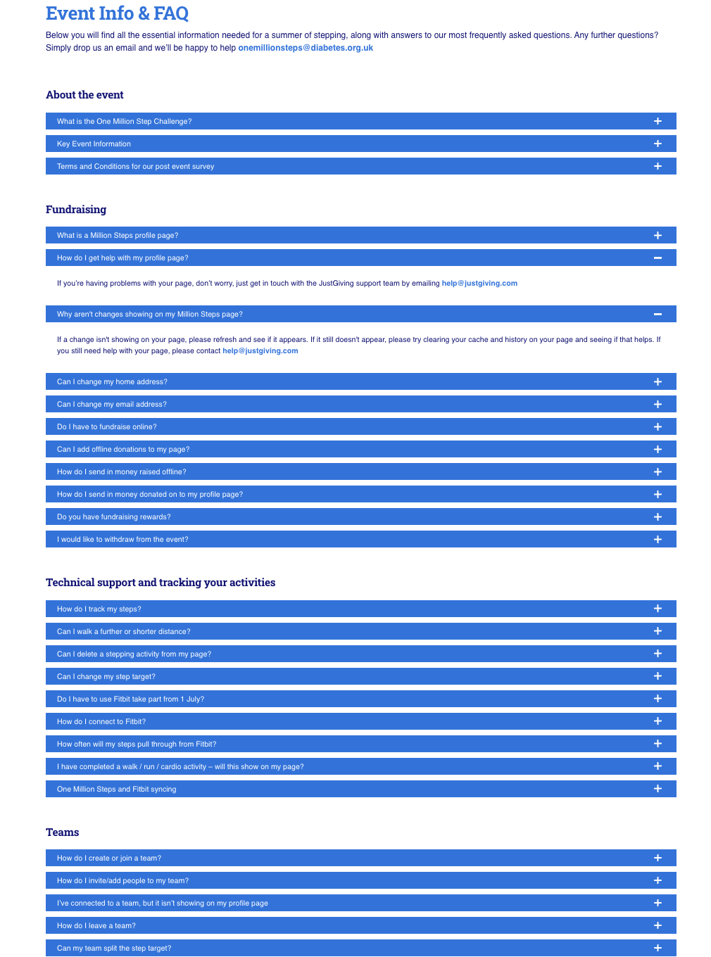
The current Info & FAQ

Suggested design
03 Improving the Visibility of the Rewards System
- Use a table on the Rewards Page to display the reward system clearly
- Add strokes around rewards badges on the Profile Page to improve their findability among other badges
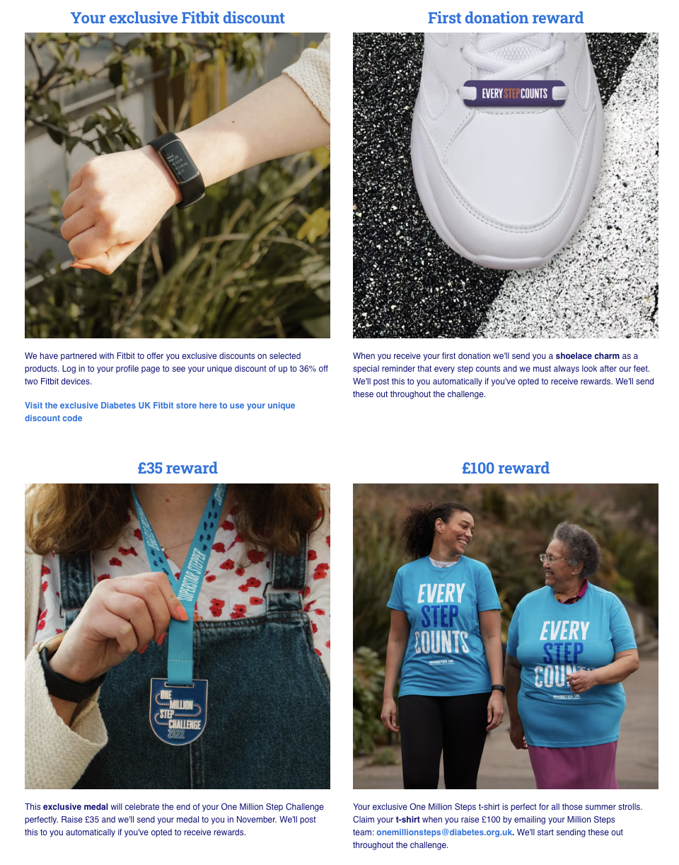
The current Reward page
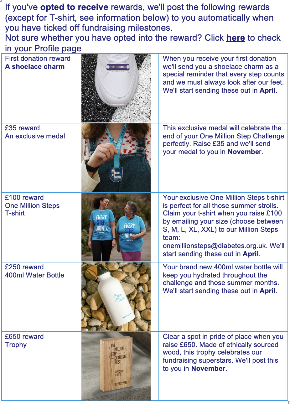
Suggested design

Suggested design for reward badges
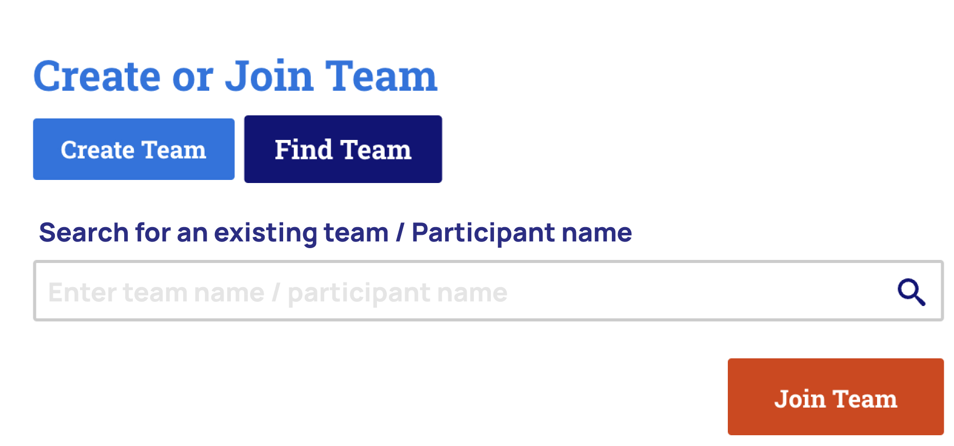
04 Improving the functionality of joining a team
- Add the "Invite people to join your team" button on Profile Page for team leaders to invite friends and family to join the team
- Expand search scope to allow users to search a team by participant profile

Suggested design
Suggested design