Building the information architecture for a skincare informational site
Skincare site
OVERVIEW
This is a school project that required us to design the information architecture (IA) of a digital information environment in our chosen domain. I chose skincare as my domain. Instead of an e-commerce platform, the emphasis is on constructing an informative website that showcases skincare products. This will aid users in finding products based on their needs, as well as providing a platform for learning more about various aspects of skincare. The final deliverables include a domain model, site map, user journey, and wireframes.
TIMELINE
Oct 21 - Jan 22
CATEGORIES
Expert Interview
Information Architecture
Card Sorting
Tree Testing
Wireframing
Usability Testing
Design Process
Domain model
I began my domain research by informally reviewing various skincare websites to get basic ideas of what people care about in terms of skincare. This helped me chart my early territory of identifying important entities of skincare, such as skincare users, skin types, skin conditions, products, and ingredients.
To further expand my domain model, I conducted three domain expert interviews: one with a chemist working in the skincare industry, and two with skincare influencers. These interviews provided a deeper understanding of the domain from both the developer and product user perspectives. The chemist shared her experience of developing a new skincare product, highlighting factors such as texture, technology used, and whether the product is cruelty-free or vegan-friendly. The influencers shared their preferences for selecting skin products and what to include in product reviews. Additionally, I interviewed a potential user who had just started using skincare, to identify any entities that the domain experts might have missed, such as price and brand.

Sitemap
The domain model served as a foundation for labeling and structuring the sitemap. However, since the website is intended for general public use, some technical terms may not be applicable or necessary. To address this, nine participants were recruited for an open card sort, in order to see how users label and organize information. The results revealed that similar groupings and labels could be found for skin types, skin conditions, ingredients, and skincare products. However, when it came to the term "skin proclivities," none of the participants could label it and instead grouped wrinkles and skin sensitivity under the category of skin condition, which was different from the domain model's categorization under "skin proclivities." It was decided not to use the term "skin proclivities" in the sitemap, as the label should speak the user's language and jargon that is not familiar to users should be avoided.
After building the initial sitemap, a tree test was conducted with 10 participants to see if they could distinguish the content between "Browse Skincare Products" and "Guide to Skincare." The test resulted in a 100% success rate.

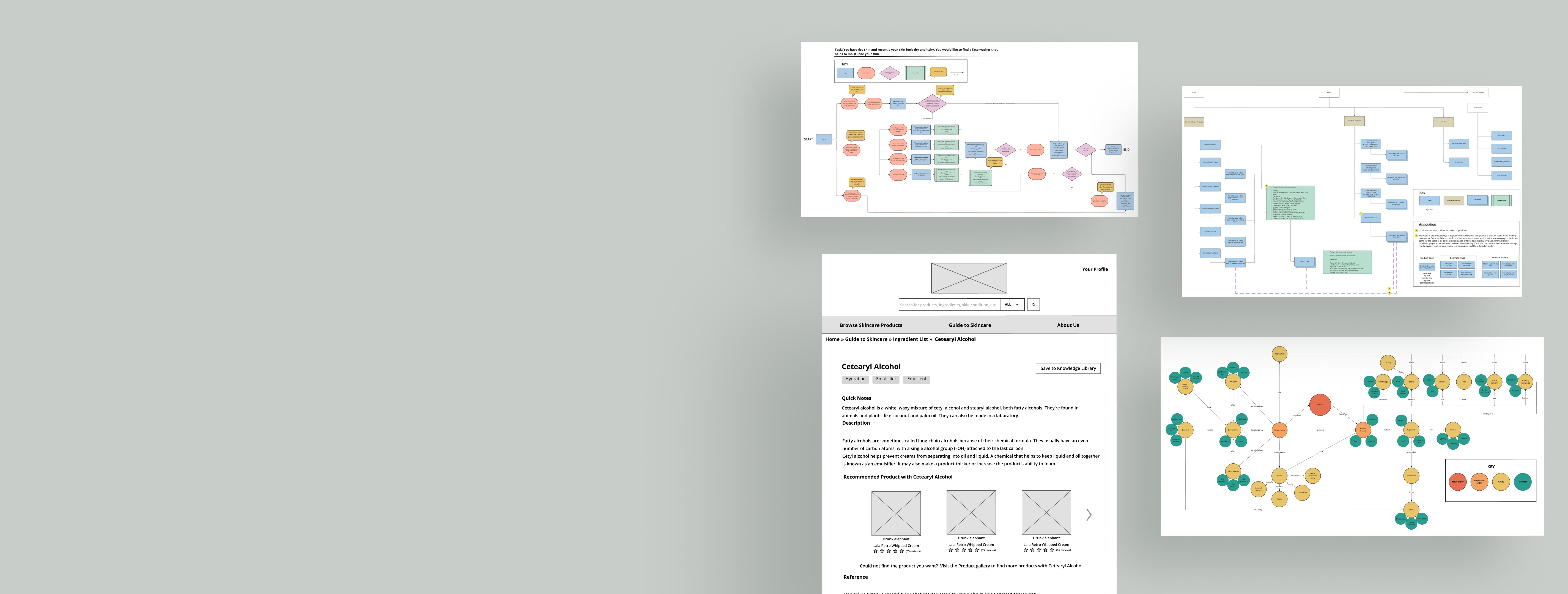
User Journey
The task I created aimed to demonstrate multiple navigation mechanisms available on the site, such as browsing, searching, filtering, hypertext, and recommendation.
Users can choose the route that works best for them in their information-seeking task. Users can start their journey through skincare products by browsing different categories or by viewing all products and refining their search with a faceted filter. They can also begin by looking at the Guide to Skincare to learn more about dehydrated skin. Then, they can click the recommended products to reach the single product page or press the hypertext of "Visit the Product gallery to find more products that target dehydrated skin" to get to the filtered product gallery page. These paths have been validated through a tree test and user testing. A participant from user testing mentioned that they preferred to learn the cause of a certain skin condition before browsing for products. In addition to browsing the product section and learning section, direct search is also available for users to search for products by entering keywords in the search bar.
Wireframe mock-ups
Four wireframes are designed to illustrate the key features of the site as well as to demonstrate the cross-links relationship between pages.
Wireframe 1 –– Giant Drop-down Menu & Search Box

Wireframe 2 –– Ingredient Page

Wireframe 3 –– Product Gallery Page

Wireframe 4 –– Product Page

Usability Evaluation
Three participants were recruited for usability testing to evaluate the wireframes from an IA perspective, with a focus on findability and discoverability of the site. After the user testing, four changes were made:
- The search box was made more visible by adding a grid around the magnifying glass icon, as one participant had stated they could not see the icon initially.
- The content order for the ingredient pop-up window was rearranged, prioritizing ingredient description over function. This was done after a participant said that when they clicked on the ingredients, they perceived the description as more important than the function itself.
- The wireframe and sitemap were refined by removing the faceted filter from the Ingredient list under Guide to Skincare. The participant shared they would only search when interested in a particular ingredient, but not others unrelated to skincare products. A-Z indexes and a search box were kept to support known item search, while faceted filters were removed.
- A member level and rating function were added to the review section. Users can now rate, sort, and filter reviews according to their personal preferences. This was done in response to a participant's suggestion that when searching for product reviews, they would like to see persuasive reviews with more than one or two sentences.